

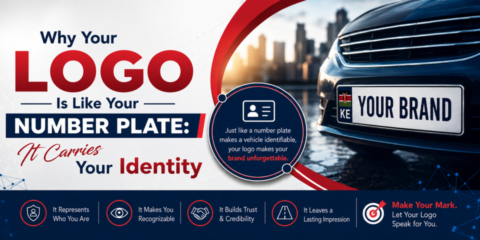
Think about a number plate for a second. It’s small. It’s simple. Just a few letters and numbers on a rectangle of metal. But that tiny plate tells a whole story — where the vehicle is registered, who it belongs to, and sometimes even a bit of its history. One glance, and it’s instantly recognizable and traceable.
Your logo works exactly the same way for your business.
A Small Space, A Big Job
Just like a number plate has limited room to say a lot, your logo has to do the same. It’s often just a symbol, a few colors, maybe a word or two — yet it’s expected to represent everything your brand stands for: your values, your quality, your promise to customers. That’s a heavy job for such a small design.
This is why graphic designers obsess over every little detail in a logo — a curve, a font weight, a shade of blue. Nothing is random. Every element is working to communicate identity in the smallest possible space, the same way a number plate is engineered to pack in essential information efficiently.
Instant Recognition Matters
You don’t need to read every digit on a number plate to know it’s a vehicle registration. The format alone tells you what it is. Similarly, a strong logo should be recognizable at a glance — even partially covered, in black and white, or shrunk down to a tiny app icon. Think of the Nike swoosh or the Apple logo. You don’t need the full picture or the brand name next to it. The shape alone does the talking.
That’s the standard great logo design aims for: instant, unmistakable recognition.
It Represents You Wherever You Go
A number plate follows the vehicle everywhere — different cities, different roads, different situations — but it always identifies the same vehicle, the same owner. Your logo does this too. It shows up on your website, your packaging, your social media, your invoices, your storefront. Wherever your brand travels, the logo travels with it, quietly saying “this is us” in every context.
This is why consistency in logo usage is so important. Just like you wouldn’t want a fake or altered number plate causing confusion, an inconsistent or poorly used logo can weaken trust and recognition.
Built to Last, Not Just to Look Nice
Number plates aren’t designed for a season — they’re built to last the life of the vehicle. A good logo should have that same staying power. Trends in design come and go, but the best logos are built on timeless principles: simplicity, balance, and meaning. They’re not just “nice” for now; they’re meant to represent your brand for years to come.
The Takeaway
Your logo isn’t just decoration. It’s identification. Like a number plate, it’s small, but it carries weight — telling the world who you are, what you stand for, and that you’re worth remembering.
So the next time you’re designing (or redesigning) your logo, ask yourself: if someone saw only this, in a split second, would they know it’s you?
That’s the real test of good graphic design.
